7 Mistakes You’re Making with AI Design (and How a Professional Graphic Design Eye Fixes Them)
- Matthew Elizondo

- Mar 23
- 6 min read
In 2026, the barrier to entry for "creating" a visual brand has never been lower. With tools like DALL-E, Midjourney, and specialized AI logo generators, anyone with an internet connection can whip up a graphic in seconds. For growth-minded entrepreneurs, this feels like a superpower. You save time, you save money, and you get instant results.
And yeah—sometimes AI really does nail it. Other times it hands you a “professional headshot” with six fingers and a third eye like it’s auditioning for a sci‑fi movie.
However, there is a massive difference between generating an image and building a brand. While AI is an incredible tool for brainstorming, relying on it entirely often leads to "uncanny valley" designs that feel hollow, confusing, or: worse: unprofessional.
At Elizondo Media Design, I see AI as a high-powered engine, but it still needs a skilled driver to stay on the road. As the solo creator behind Elizondo Media Design LLC, I bring the professional graphic design eye that keeps your AI-generated assets from pushing potential clients away.
Here are the seven most common mistakes entrepreneurs make with AI design and how a human-first approach fixes them.
Why did the AI get kicked out of art school? Because it couldn't get a "grip" on drawing hands.
1. “Vibe-less” Generic Visuals
The most common mistake happens before a single pixel is generated. Most users treat AI like a mind reader. They type in "cool modern logo for a tech company" and wonder why the result looks like every other generic startup logo from 2022.
The Problem: AI operates on averages. If you give it a generic prompt, it will give you the most "average" interpretation of that prompt. This creates a visual identity that feels polished but vibe-less—no personality, no point of view, and no competitive edge.
Pro-Fix: Get hyper-specific with your inputs and your guardrails. I don’t just ask for “cool”—I specify composition, line weight, negative space, contrast, mood, and references that match your market. Using an AI Strategy, I steer AI toward options that actually sound and look like you, then I refine the best direction into a brand-ready asset.
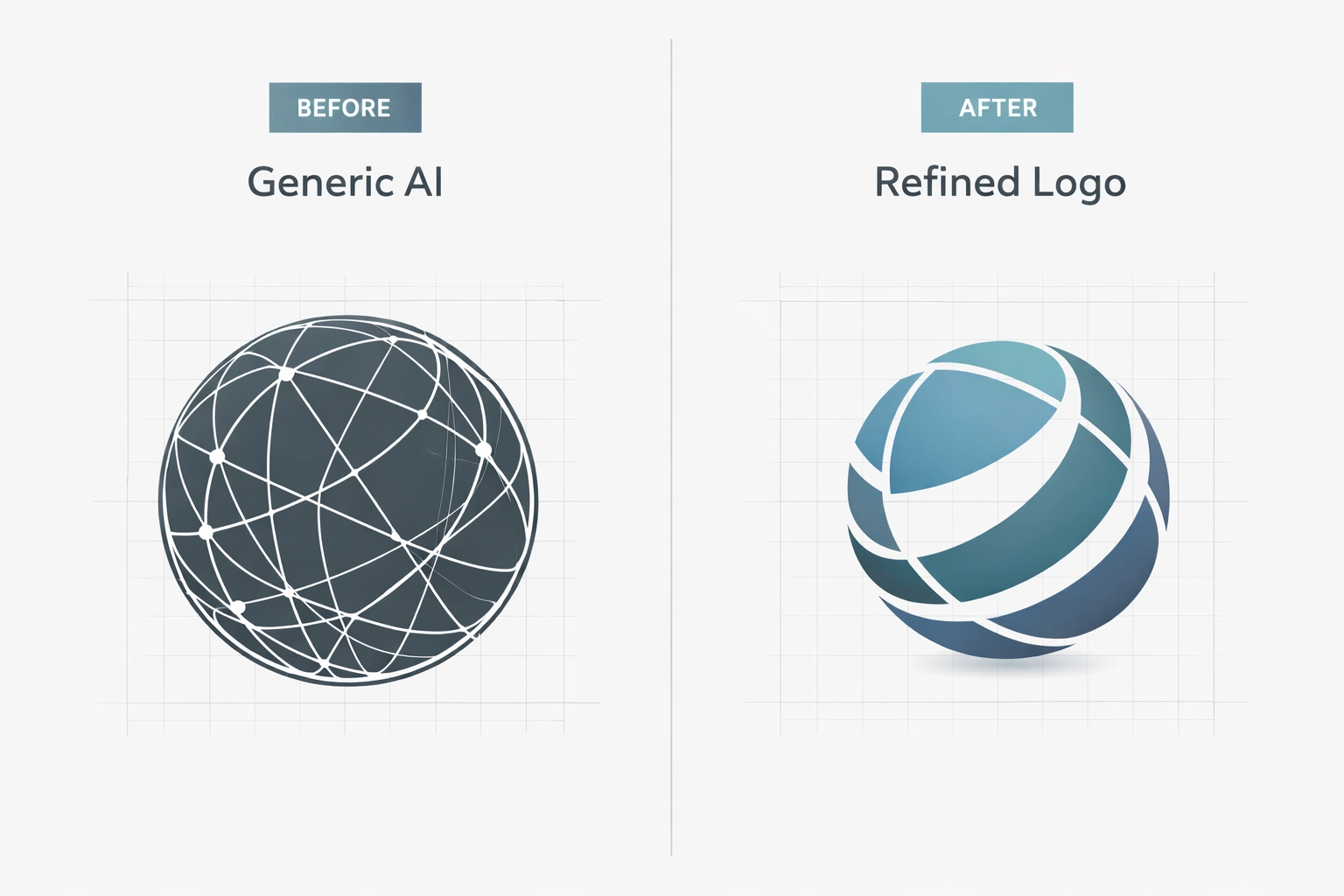
Caption: A comparison between a generic AI prompt result and a refined, professionally-steered brand asset.
2. Neglecting the "Why" Behind the Brand Identity
AI is great at the "what," but it has no concept of the "why." A machine doesn't know that your grandfather started your firm or that your target audience values "traditional reliability" over "disruptive innovation."
The Problem: AI creates graphics based on patterns, not values. It doesn't understand your brand’s story or your specific place in the market. This often results in a "pretty" picture that completely fails to resonate with your actual customers.
Pro-Fix: I start with a quick discovery phase. Before touching a single tool, I look at your Financial Advisory Solutions or your specific niche to understand your mission. Then I translate that into clear creative direction (keywords, do/don’t lists, and visual references) so the final design—AI-assisted or not—actually connects with the people you’re trying to reach.
3. Hierarchy Havoc (No Clear Focus)
AI has a tendency to be "extra." If you ask for a logo involving a tree, a gear, and a dollar sign, it will try to cram every single one of those into a single, cluttered graphic.
The Problem: This creates hierarchy havoc—everything is competing for attention, so nothing wins. Good design is often about what you remove, not what you add. Without a clear focal point, your audience doesn’t know what to look at first, and your message gets lost (especially on mobile).
Pro-Fix: I rebuild the layout using a simple hierarchy system:
One primary focal point (the “headline” of the design)
One supporting element (the “subhead”)
Everything else removed or minimized That’s how you get a mark that reads cleanly on a billboard and a profile photo. You can see examples of this clean approach in my Digital Media Design Strategy portfolio.
4. Ignoring Color Psychology and Technical Accuracy
AI frequently hallucinates when it comes to color and geometry. It might give you a logo that looks great on your screen but uses a "neon" blue that is physically impossible to print on a t-shirt or business card.
The Problem: AI doesn't understand CMYK vs. RGB or the psychological impact of specific hues. It might choose a bright red for a "calming yoga studio" simply because it looks "bold." Furthermore, AI often struggles with symmetry: one side of a logo might be slightly thicker than the other, creating a subconscious feeling of "wrongness" for the viewer.
Pro-Fix:
Precision refinement: I manually adjust colors to ensure brand consistency across all platforms.
Geometric correction: I rebuild AI concepts into vector formats, ensuring every line is perfectly straight and every curve is mathematically sound.
Psychological alignment: I choose palettes that evoke the right emotions: trust for finance, energy for fitness, or sophistication for luxury.
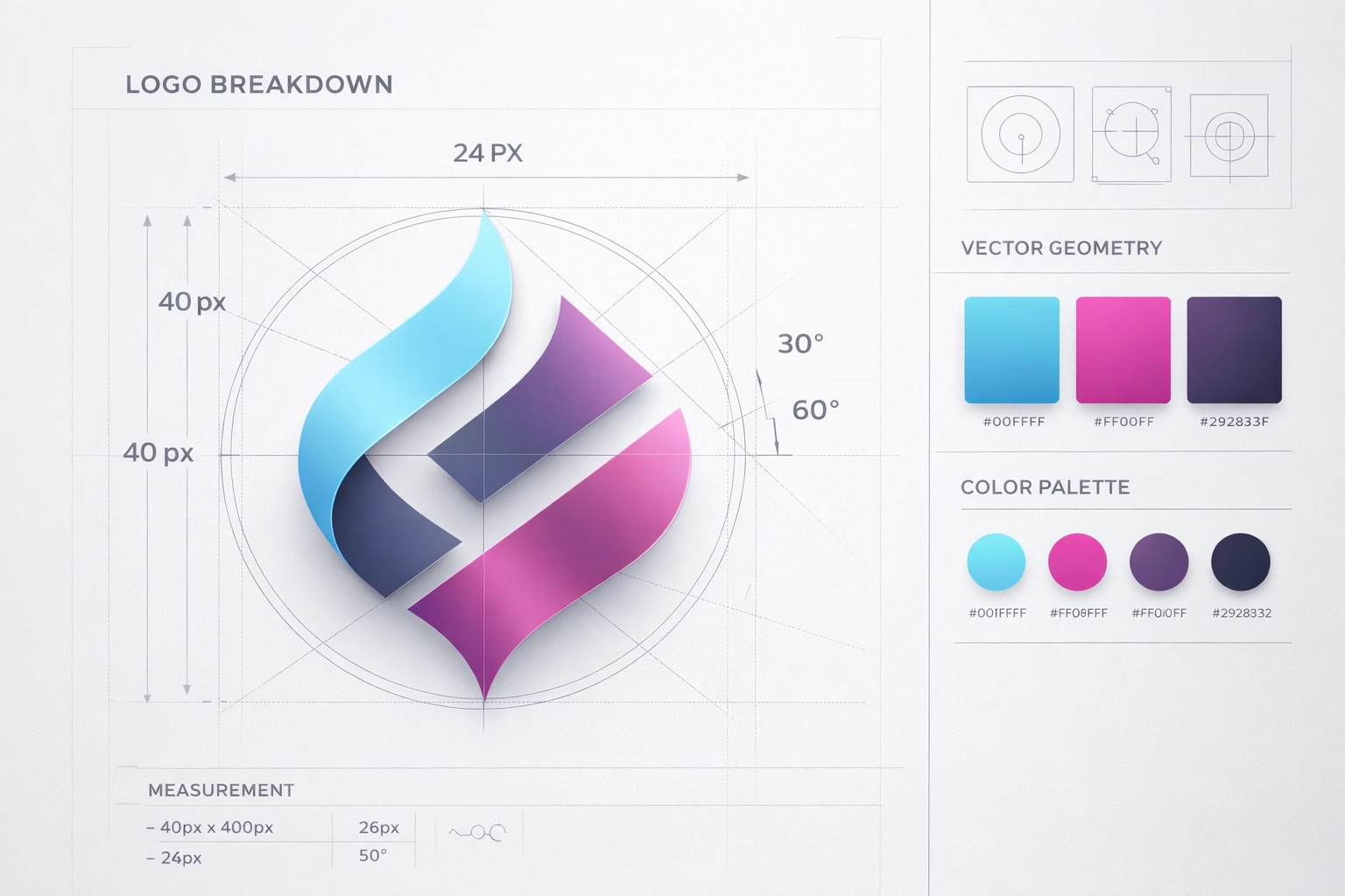
Caption: The technical breakdown of a logo, showing the alignment and color balance a professional designer provides.
5. Chasing Short-Lived "AI Trends"
Because AI is trained on what is currently popular on the internet, it tends to generate designs that look very "2026." While this feels modern now, it risks dating your brand within eighteen months.
The Problem: Chasing trends leads to a lack of longevity. If every brand in your industry is using the same AI-generated "glassmorphism" or "3D bubble" style, your brand becomes invisible. You become part of the background noise instead of a leader.
Pro-Fix: I focus on timeless design principles. I’ll use AI to speed up the idea phase, but I anchor the final output in fundamentals that have worked for decades—strong typography, clean spacing, intentional color, and clear hierarchy. For more on how I mix innovation with long-term strategy, check out my post on Innovative Design Meets Financial Strategy.
6. Failing to Review Designs in Real-World Contexts
A logo doesn't live in a vacuum. It lives on hats, apps, invoices, and email signatures. AI tools usually give you a square image on a white background. They don't show you how that design fails when it’s shrunk down to 16 pixels for a website favicon.
The Problem: Entrepreneurs often approve an AI design because it "looks cool" on a large monitor, only to realize later it’s illegible on their Instagram profile or expensive to print because of too many gradients.
Pro-Fix: I run quick real-world stress tests. I place your designs in mockups, shrink them down, and check contrast and readability across formats. That’s how I make sure your Media Design assets are functional—not just decorative.
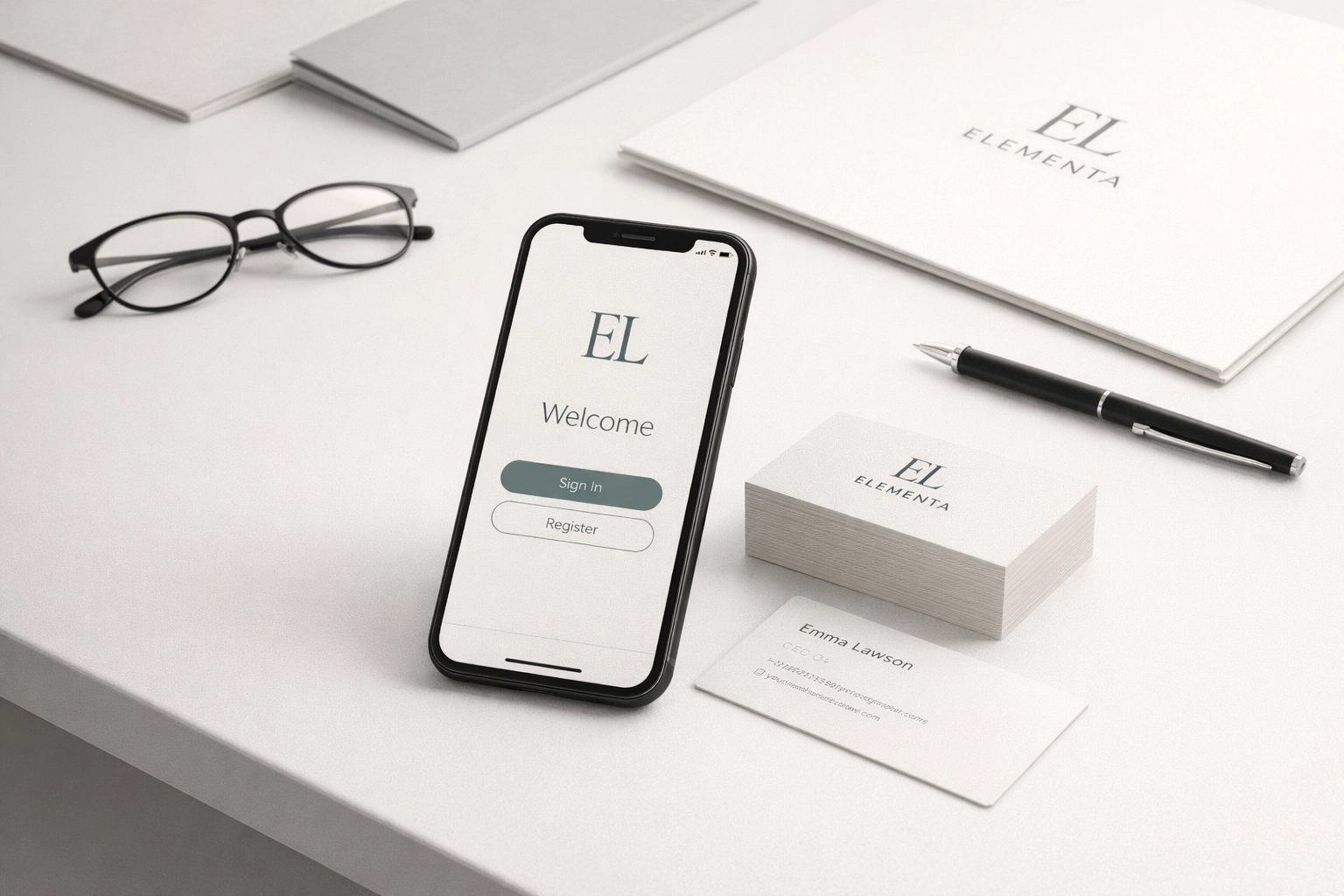
Caption: A brand identity being tested across multiple platforms, from mobile screens to physical stationery.
7. “Text Salad” (Unreadable AI Text)
AI can generate a cool-looking flyer or social graphic—until you zoom in and realize the words are basically alphabet soup. You’ll get letterforms that don’t exist, spacing that makes no sense, or a headline that looks readable at first glance but falls apart the moment someone tries to actually read it.
The Problem: This “text salad” kills trust fast. If your audience can’t read your offer in two seconds, they’ll scroll. And if your text looks “off,” it can make the whole brand feel low-effort—even if your service is solid.
Pro-Fix: I treat typography as non-negotiable:
Replace AI text with real type (licensed fonts and clean kerning)
Lock in hierarchy (headline, subhead, CTA—on purpose)
Proof for clarity on mobile first AI can help with layout ideas, but I make sure the final version reads clean and converts.
Bridging the Gap: Why You Need a Creative Partner
As an entrepreneur, your time is your most valuable asset. While you could spend hours fighting with a prompt to get a logo that’s "good enough," I bridge the gap between raw AI potential and a finished, professional brand initiative as the solo creator at Elizondo Media Design LLC.
I don't just give you a file; I give you a visual system. This includes:
Vector Files: So you can scale your logo to the size of a building without it getting blurry.
Brand Guidelines: So you know exactly which fonts and colors to use every time.
Strategic Insight: Ensuring your design aligns with your Financial Literacy goals or business growth plans.

Caption: The Elizondo Media Design process: From AI-assisted brainstorming to professional, high-fidelity brand delivery.
Conclusion: The Human-First Advantage
AI is a tool, but it isn't a strategy. For growth-minded entrepreneurs, your visual identity is one of your biggest financial assets. It’s the face of your company and the first thing potential clients see.
Don’t settle for "generated." Aim for crafted. By combining the speed of AI with the critical eye of a professional designer, you get the best of both worlds: efficiency and excellence.
Ready to take your brand from a generic AI output to a professional visual identity? Whether you need a full branding package or want to refine your existing AI concepts, I’m here to help.
Book a service or consultation today and let’s build a human-first brand that stands the test of time. You can also explore my Portfolio to see how I’ve helped other entrepreneurs bridge the gap between technology and original design.
Just sharing what I’ve learned from the front lines of design. If it helps, run with it.
Comments